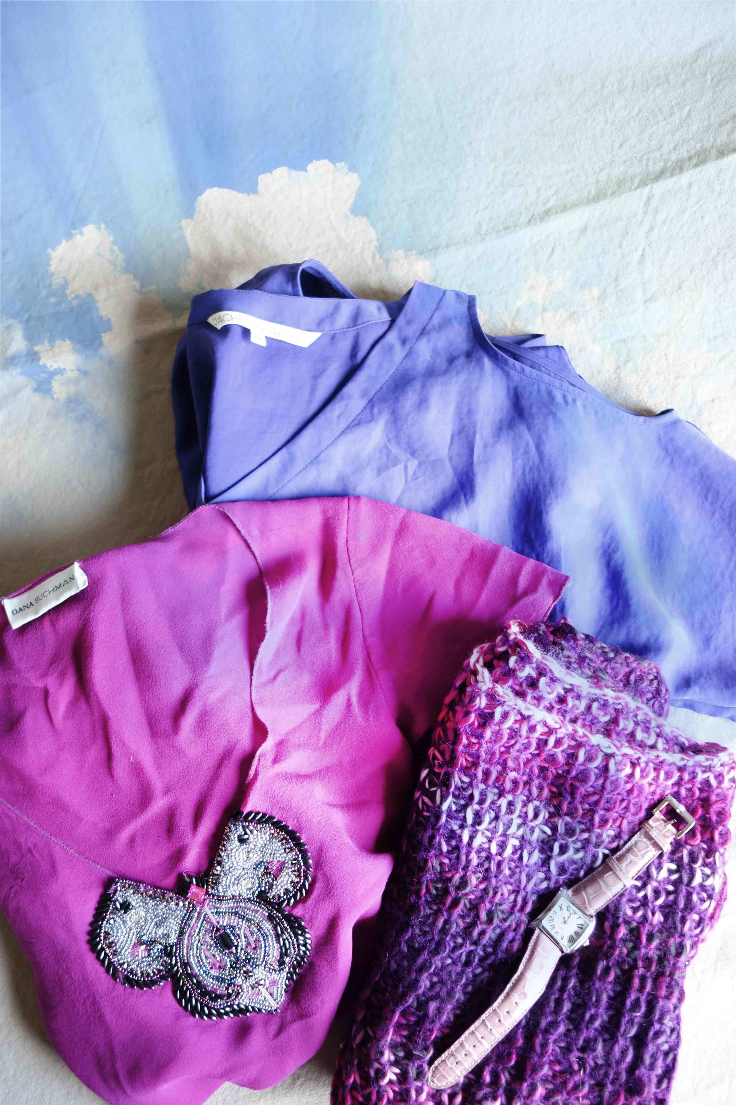
The Pantone Color of the Year is Radiant Orchid | 18-3224
Personally these violaceous tones have always made me feel indifferent. I think it definitely is a happy and traditionally it has been considered royal, yet I think there is more to the amethyst hues than meets the eye… sadness. Maybe the answer relies in the hope of "growth, renewal and prosperity" as previously quoted. Perhaps the warmth mixed within the bruiting blues paints a reflection of where we stand in the global zeitgeist of 2014. Gaza, Israel, and our economy just to name a few reasons... And in furthering this idea, this reminds me of our desire for more self-reliance and creativity. How about you? Do you find yourself enamored by this fuchsia tone? If so, have you ever thought of why?
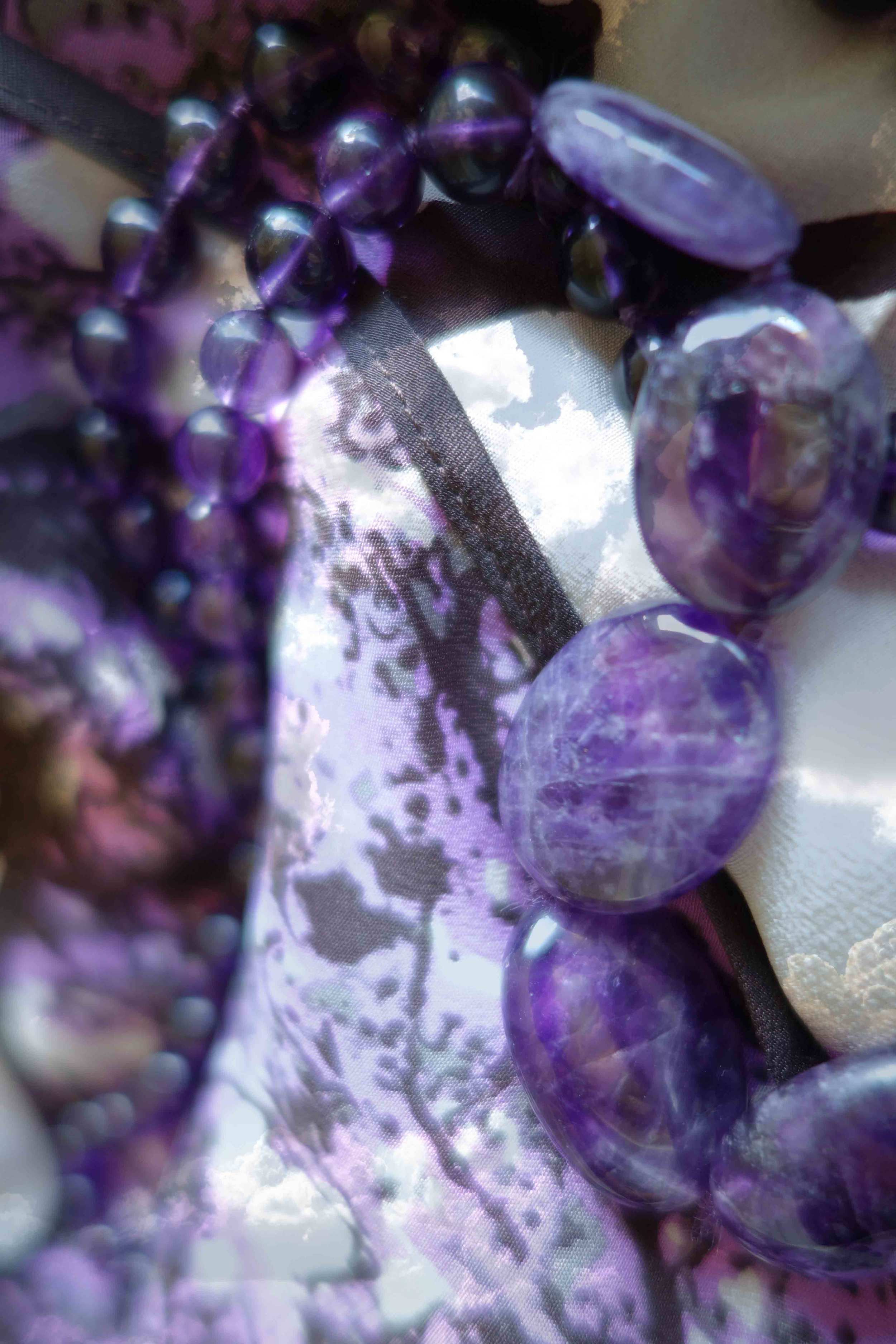
As shown above, the Amethyst stone has been said to bring to emotional reasoning + luck in love
this year color can be seen anytime you look over your shoulder! And now that you saw this post… it will be even more obvious.
trend: ombre is everywhere is year
tip: Add yellow ochre to make purple pop | it is on the opposite spectrum of the color wheel


